Design is to create and solve problems in a context insofar that meaning and purpose is given. The images and text that accompany a design direct its intentions and are crucial to how it is perceived by its audience. “Graphic design has been used in the process of nation-building to create awareness; affect behavioural change; and represent notions of everyday experience, identity, and ideology” (Chan 2011), we explore how Singapore has visualised its identity and its effect on contemporary design practices.
Since 1965, The independent nation “has foster[ed] for the development of a Singaporean national identity among the population” (Chan 2011), prioritising the bringing together of ‘plural societies’. The Singaporean government communicated this through campaign posters with its national languages Mandarin, Malay, Tamil and English. A clever design strategy that was inclusive of all age groups and ethnics reinforces a diverse representation which constitutes of Singapore’s identity.
The 1979 Mandarin Speaking campaign encouraged Singaporeans to adopt “Mandarin is Chinese”. This was intended to create “…a single people, speaking the same primary language, possessing a distinct culture and a shared past, and sharing a common destiny for the future” (Goh 1991) but also to boost economic growth for a nation with economic success as it’s emblem (Huat 2011). Blatant slogans such as, “I like to speak Mandarin; It’s convenient for everyone” indirectly encouraged trade with China resulting in economic growth. Though stirred uproar in the community for different reasons, some viewed it as a “propaganda tool to eliminate the Chinese dialects” (RemSG 2014) others pointed out that “the Malays and Indians felt threatened and perhaps even alienated by the repeated exhortation to speak Mandarin and consequently heightened the racial consciousness of all Singaporeans” (Chan 2011). Evidently, this poster would not penetrate well today but to cater to a contemporary audience a modernized campaign poster “The Chinese Challenge” was released. The more contemporary, playful artistic style (use of wit and puzzle along further highlighted by the graphic vector figure and ground) projects a subtle yet effective message better suited for the modern context. The campaign that began in 1979 intended to bring together a Chinese community through a single language has had a drastic face-lift to penetrate an English audience.

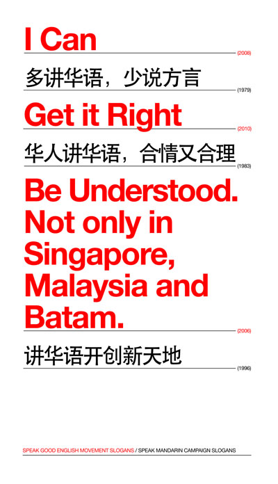
These national campaigns became part of Singaporean society which was reflected in the exhibition, “Campaign City: Life In Posters”, a collection of posters “based on [their] personal memories of various campaigns” (Zhuang 2013). Zhuang’s poster is a confusing mash of slogans from various government language campaigns and illegible for those not familiar with English and Mandarin. He explains, “growing up…under Singapore’s two language campaigns…I always felt caught in-between”, a campaign which was supposed to connect Singaporean Chinese with their roots was alien to English speaking families and their elders who spoke dialects, a sense of lost-ness is evident for Zhuang and maybe many more Singaporeans.

The ‘SG50 Red sticker’ campaign was intended to celebrate the Singaporean spirit, inspired by “our obsession with mascots; how we reserve tables with tissue packs; the way we pack our coffee-to-go” (Loh 2014). The campaign included designing “50 icons of SG” in the form of stickers that were plastered across town reminding the locals of the quintessence of Singapore. Like the ‘Mandarin speaking’ campaign both promote cultural pride and a define a sense of identity. However, the Red sticker campaign embodies a much more uniquely Singaporean message which reflects a nation that has developed and is proud of its identity.


Design, whether it’s the form, message or aesthetic value, is dependent on its context. The different motifs these various campaigns project represents a change in context, that is, Singapore’s changing identity and attitude over the years.
References:
Chan, K.L. 2011, ‘Visualizing Multi-Racialism in Singapore: Graphic Design as a Tool for Ideology and Policy in Nation Building Design Issues’, MIT Press, vol. 27, no. 1, pp. 63-69.
Goh, C.T. 1991, Launching ceremony of the 1991 speak mandarin campaign, speech,
Huat, C.B. 2011, ‘Singapore as model: planning innovations, knowledge experts’ in Ananya Roy and Aihwa Ong (ed) Worlding cities : Asian experiments and the art of being global, Wiley-Blackwell, West Sussex, UK.
Loh, J. 2014, Integrated: Things that make us, Singapore, viewed 5 Jan 2018,
< https://www.behance.net/gallery/15177015/Integrated-Things-that-make-us>.
Loh, J. 2014, Chope icon in context, Behance, viewed 5 Jan 2018,
< https://www.behance.net/gallery/15177015/Integrated-Things-that-make-us>.
Ministry of Culture 1984, I like to speak Mandarin, it’s convenient for everybody (Wo xi huan jiang hua yu, hua yu ji fang bian you rong yi), National Archives of Singapore.
Promote Mandarin Council 2009, The Chinese Challenge, National Archives of Singapore.
RemSG 2014, Singapore Campaigns of the 70s/80s, Singapore, viewed 5 Jan 2018,
< https://remembersingapore.org/category/about-remsg/>.
Singapore Courtesy Council 1998, A Little Kindness Goes A Long Way-Courtesy. Try A Little Kindness, National Archives of Singapore.
SG50 2014, Icons of SG, SG50, viewed 5 Jan 2018,
<https://www.sg/ICON.aspx>.
SMC 2018, About the campaign, Singapore, viewed 5 Jan 2018,
<http://mandarin.org.sg/en/about>.
Zhuang, J. 2013, Campaign City-National Language Class, Singapore, viewed 5 Jan 2018,
<http://justinzhuang.com/posts/tag/poster/page/2/>.
Zhuang, J. 2013, Speak Good English Movement Slogans/Speak Mandarin Campaign Slogans, Justin Zhuang, viewed 5 Jan 2018,
<http://justinzhuang.com/posts/tag/poster/page/2/>.


It’s good to see you researched the developments of Singapore design especially in relation to language and identity wise. The designs you showed are really great examples to show this idea. The last example really portrays the values and messages the designer trying to convey. It is interesting to see the historical changes of graphic designs from 1960’s till now.
LikeLike
The language campaigns that used design as a means of projecting those ideologies is a particularly interesting area of study, especially in relation to class and racial harmony in Singapore. I do wonder if Chan was also inadvertently referring to population make-up as well when discussing the fear and alienation of the Indians and Malays. These campaigns no doubt would have added to the underlying tensions that were constantly being combated against through the many multiracialism policies.
LikeLike